


What beverage would you choose to buy at a shop?
A Comparative Analysis

What beverage would you choose to buy at a shop?
Imagine you are in a very hot place, parched, and you decide to buy a beverage for yourself from a shop. You may choose something familiar or opt for something new. The question is- What do you do? Is the choice that you make in your total control? Or is someone directing you to it?
Keeping aside the beverage's taste and brand recognition, consumers can be subconsciously directed to making a choice by certain external features. How do brands do this? Simply by knowing what their brand is about. What is the main selling point of your beverage- Is it the taste (adventurous, refreshing, playful), the cost (cheap and accessible to a mass crowd), or the mere 'feeling' (of refreshment, energy, fulfillment) that the drink would give you?
The Coca-Cola Company, being a well-established brand, doesn't need to work hard to reach its audience. As a result, it maintains a consistent packaging design across its products. Fanta, Sprite, Coca-Cola, and Thumbs Up (fig 1.1-1.4) all share the same form. Although Fanta (fig 1.3) is not among the most commonly purchased drinks, its familiar packaging may encourage consumers to give it a chance. Additionally, the smaller 250ml bottles are proportionately derived from the larger, more recognizable 500ml bottles.

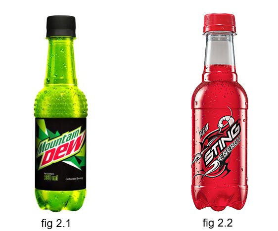
Brands like Mountain Dew and Sting that target a specific age group, say the youth, need to identify the elements of attraction for their consumers. Youth symbolizes action, enthusiasm, energy, and adventure, which is often reflected in their choice of bold, unconventional colors. For example, Mountain Dew (fig 2.1) features a neon body packaging , while Sting (fig 2.2) has an eye-catching red color with a transparent bottle. Despite their different colors, both beverages have a similar form: a long, narrow neck that resembles a dumbbell, perhaps evoking a sense of strength and vitality.
Building trust can be effectively achieved through presentation. While you might choose to enjoy fresh juice or a piece of fruit, you still occasionally opt for a bottle of Maaza or Minute Maid (fig 3.1, fig 3.2) , even though you know that it's not entirely pure. These bottles have a distinct, appealing texture that gives them an organic feel, creating a sense of "natural" in these man-made drinks.

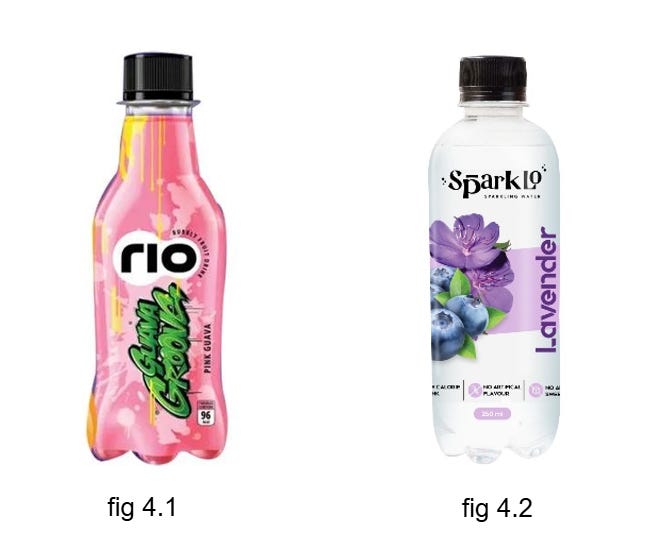
We see Rio and Sparklo, upcoming, possibly to be trendy beverages. Now here, they want attention. They seek the audience reach. To do so, Rio (fig 4.1), has its body majorly (or almost completely) covered with its label. You wouldn't see a lot of people ordering Rio in a shop as its selling scope will mostly be by them noticing it and then ordering it (not ordering it out of prior taste experience). Sparklo (fig 4.2) on the other hand, enforces "No Natural Flavors" and "No Additives" so it simply has a transparent body to show the honesty.
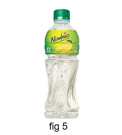
Some of these are just creative, like the classic Nimbooz (fig 5) one would go for on a hot summer day. Each sip of it, full of pleasurable sourness concludes that more the lemon, better the taste. The analogy will make more sense if I say, more the 'squeeze' of the lemon, better the taste. The next time you buy a Nimbooz bottle, you will notice a 'squeeze' in its form.
The form, the transparency of the bottle, the colour of the drink, the texture on the bottle, the proportion of the label with the bottle and further possible features in the bottle that I might have missed, are very thought through. So, I end up asking you the same question- Is someone directing you to it?
Now, imagine as equally parched on a hot sunny day. You visit a shop and find identical bottles with no distinguishing features—no texture, no graphics, and no unique shapes. As a result, you choose something familiar and comfortable.
If this kind of monotony were to become the norm, how do you think brands would evolve?
This is incredibly well written, very interesting observations! delighted to read more of these
crazy insights